

Black and White
In art and otherwise.
In case you missed it: Made With Artist Intelligence stickers. I’m behind on shipping this week but if you ordered last weekend they are going out soon. Paid subscribers: there’s a discount code for one here.
Hello friends,
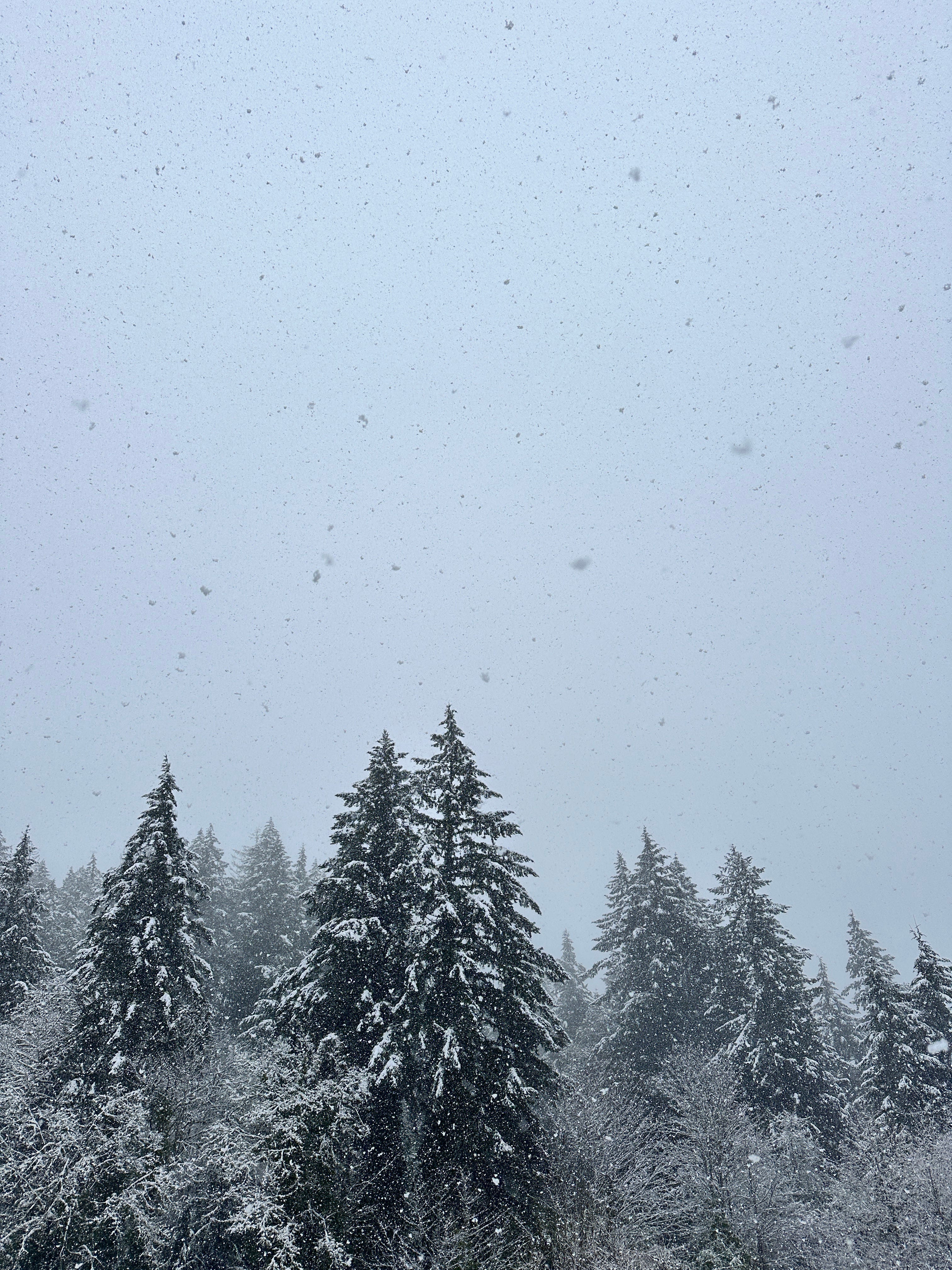
The main item of note from my part of the world is that it snowed yesterday.
While March snow might be a usual occurrence in other places, this is quite uncommon here in Western Washington. As it turns out we had an atmospheric river1 to thank. Of course.
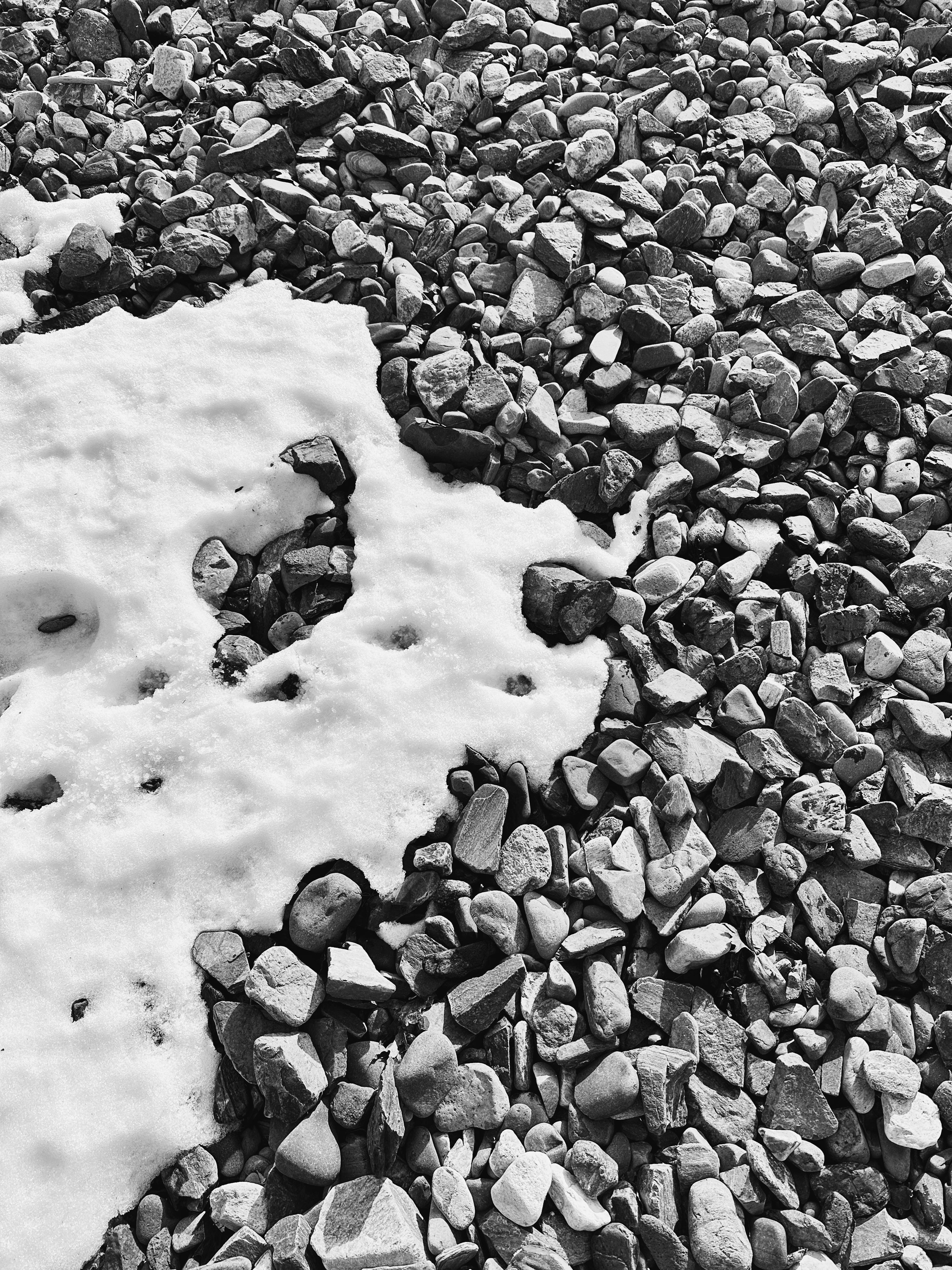
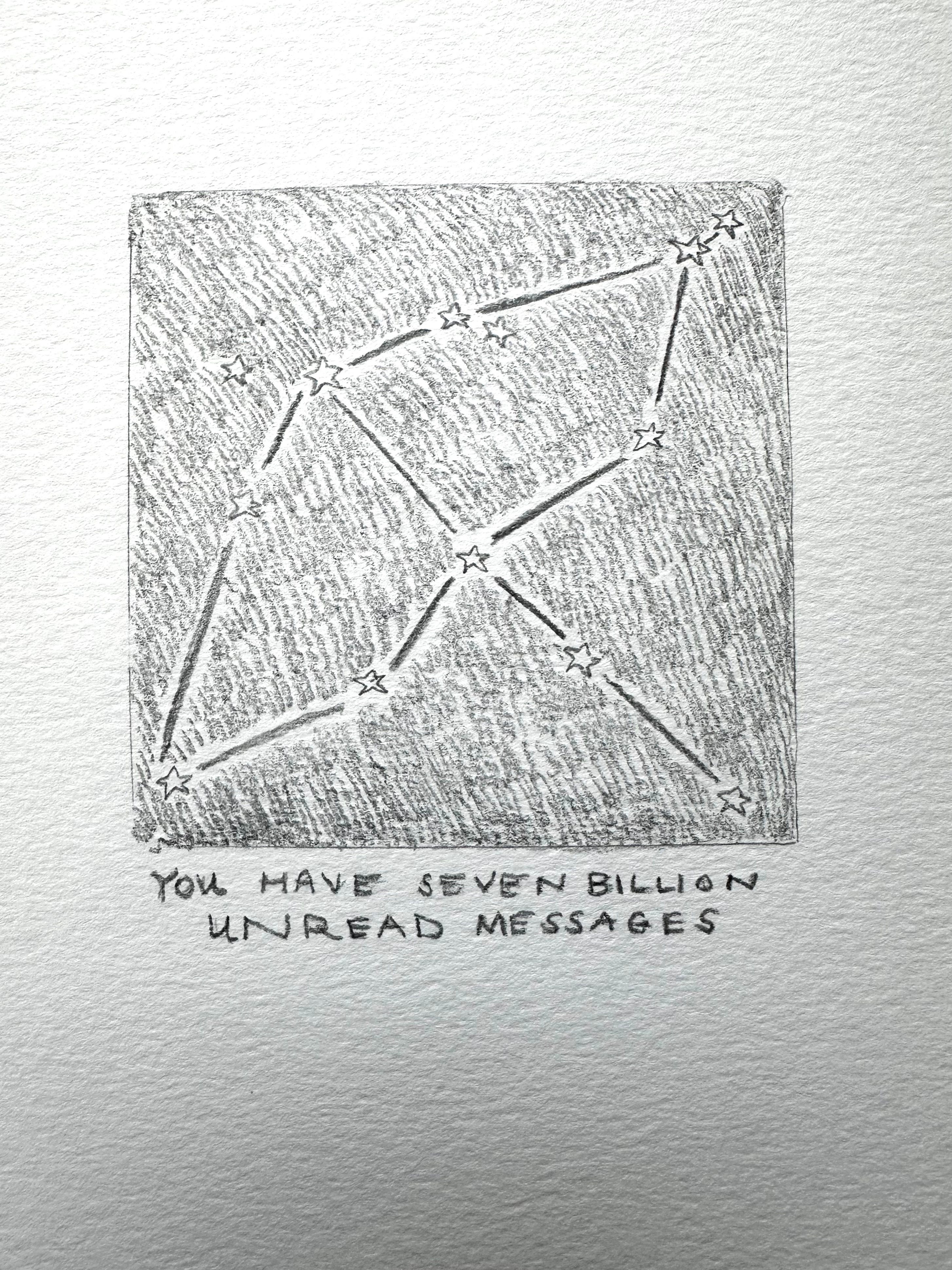
What I like about snow is how it can make a landscape look almost like it’s in black and white. Blue hour turns into gray hour.

I was reading Notes from an Island this week, Tove Jansson’s book about Klovharun where she spent many seasons with Tuulikki Pietilä (known as “Tooti”). This is Jansson describing being on the island in March:
“When we woke up, the whole ocean was full of broken ice. Unbelievable tabernacles floated by, driven by a mild south-west breeze, statuesque, glittering, as big as trolleys, cathedrals, primeval caverns, everything imaginable! And they changed colour whenever they felt like it—ice blue, green and, in the evenings, orange. Early in the morning they could be pink.
…
Tooti said something about how it’s all very well to go all technicolor nineteen times a day, but the purest and most honourable colors are still black and white.”
You know that as a lover of black and white art, the sentiment rang very true.
Black and white allows us to simplify in order to also see what isn’t there. Black and white won’t distract you, it focuses you on the essential.
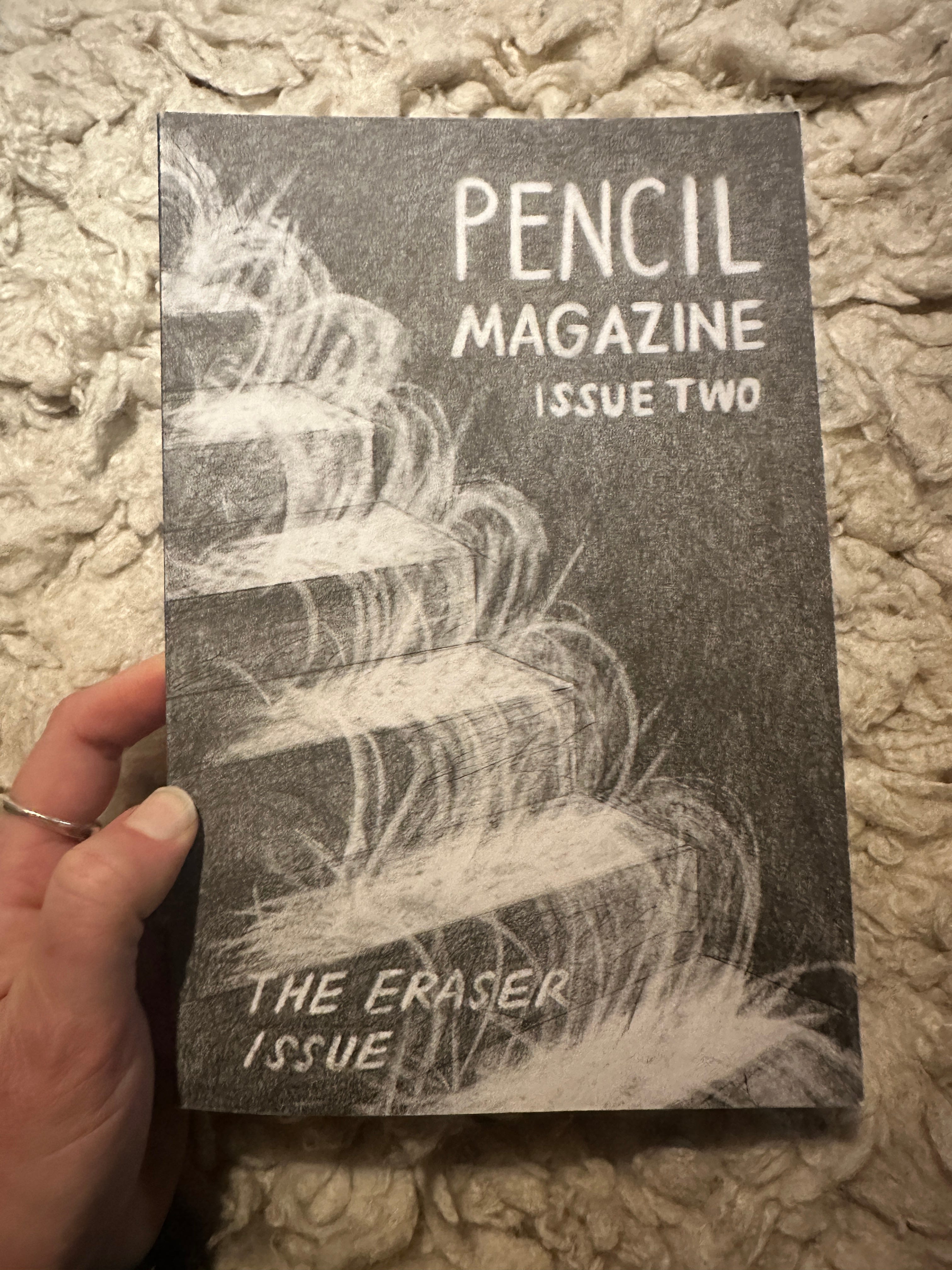
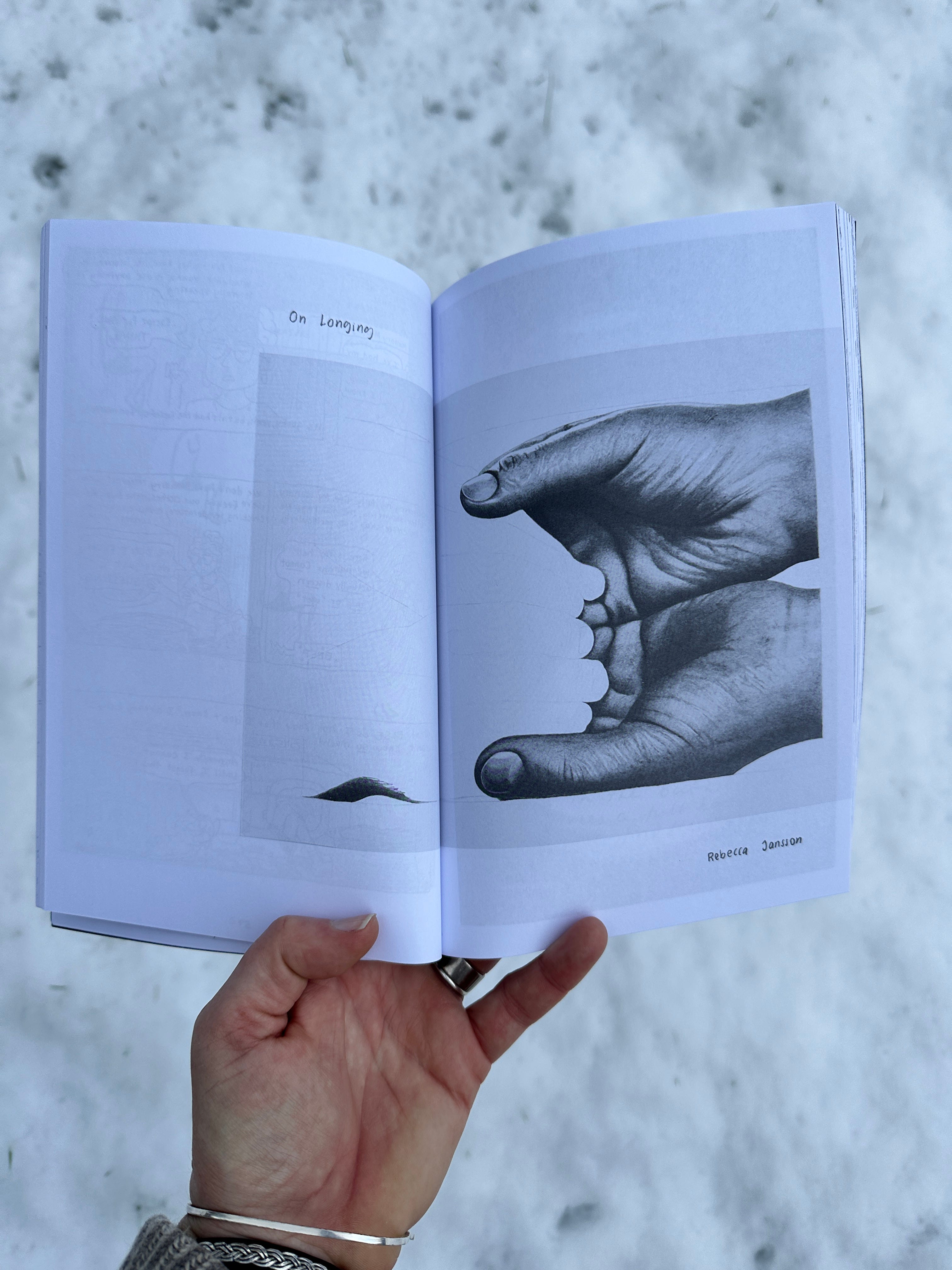
I discovered Pencil Magazine this week, a publication that features a variety of submissions, but all made entirely with graphite and paper. This issue in particular had the theme of “The Eraser.”
Erasers are “basic tools: fixers of small mistakes, creators of negative space, attendants to inevitable changes of mind,” writes editor and publisher Sasha Wizansky. “But when I think of erasure—nearly the same word—the visions are decidedly heavier. Erasure evokes disappearance. Personal, political, and cultural deletion on intimate and community-wide scales.”
Reading that I couldn’t help but think about the black clouds over Teheran, toxic swirls above the city, chemicals lifted into the atmosphere only to come back down in the form of toxic rain. As Ayana Elizabeth Johnson writes, “I find myself thinking how a world a world powered by renewable energy would be fundamentally better in so many ways. A world without petro-states and petro-dictators would be a much safer and less toxic world.”
When you work in black and white (or any positive and negative space) there’s so much nuance you can’t portray. That’s both a hindrance and a gift. Whenever I make a papercut, there’s often so much texture and moodiness I want to capture, and have to figure out other ways of weaving that in. The benefit lies in black and white’s simplicity. It’s an excellent way to distill down to the essential.
No wonder it’s a tried-and-true combo for posters and art made to carry a message.
When we see something as “black and white,” we mean two things in total opposition. No middle ground for questioning. A good or bad, a right or wrong. An obvious choice.
The world seems so much simpler when we view it as an either/or doesn’t it? I want to honor the need for nuance. Life functions on a spectrum, nature doesn’t exist on a binary. And yet there is so much that I want to pass through a “good and bad” lens these days. I can’t help myself. There’s so much to scream about. $1 billion a day war? Bad. Pedophiles? Bad. Men in power who don’t have to be accountable? Bad. Environmental destruction? Bad.
Maybe this is why I am drawn to black and white as a medium. Sometimes we want to simplify and speak in absolutes.
My friend Roshni Robert has been working on a series called Second Person Cosmic Messaging System, all made with pencil. She told me that the draw to work solely in graphite stems from a deep craving for analog methods. I know the feeling.
Sometimes I’ll see an ad for different Procreate brushes, all made to look like pencil texture and I have a little moment of panic. I wonder what it would be like to never know what it feels like to pull a pencil across a page. To push a little harder to darken the line, pull back in order to soften. Or simply to go to your pencil stash and pull the right one for the project.
8B 6B 5B 4B 3B 2B B HB F H 2H 3H 4H
It sounds like a kind of code. Or a spell. The kind you can’t replicate with digital means.
I shouldn’t judge. I use an app to make photos black and white all the time. Add a little grain for some texture. It was a long time since I stepped foot in a darkroom.
Aristotle thought that all colors stemmed from black and white, an idea that stuck around for millennia. Dark crimson was said to come from a mixture of black with sunlight or firelight.
I like the idea of drawing with sunlight and fire, as if you could hold them both in your hand and use them to mark a page. Of course, we’ve been using fire for a long time to get us to black, burning all kinds of things in order to be able to create with the leftover soot.
In a piece on lamp black—a color she calls “a bit of a trickster”—Katy Kelleher cites Michel Pastoureau, writing in his book Black: The History of a Color:
“Ancient cultures had a more developed and nuanced awareness of the color black than contemporary societies do. In all domains, there was not one black, but many blacks. The struggle against darkness, the fear of night, and the quest for light gradually led prehistoric and then ancient people to distinguish degrees and qualities of dark, and having done so, to construct for themselves a relatively wide range of blacks.”
Even black and white is a matter of nuance.
When color film hit the market, allowing photographers to go beyond black and white, there were books devoted to helping people not only take pictures, but also help them “see” color. Photographers warned against “color for color’s sake.” If not, you risked ending up with “a veritable ‘color hash,’” as one Kodak editor put it.
Skeptics of color film were grappling with the question: what does the world really look like?
We’re still grappling with that question, but now we have tools that make the distinction between the tangible world and the real world even more complicated. What is real anymore?
“The ubiquity of digital cameras, especially smartphone cameras, would seem to simplify this project, enabling immediate comparisons between pictures and the things they depict. Already the work is fraught, however: smartphone screens are two-dimensional backlit displays, while things in the natural world are illuminated by reflected light,” writes Kim Beil. “Yet, as weekly screen-time notifications make painfully clear, we spend more and more hours in front of our phones, making its saturated glow seem more and more natural.”
I changed my phone to grayscale the other day, in order to make the screen a little less flashy, a little less appealing. It is supposed to work wonders for you screen time. Removing all of the the color is said to dampen your urge to stick around. I haven’t had it long enough to make any true assessment, but the change is wild.
Forget playing Wordle for starters. Now all of my photos are in black and white. But more importantly, it’s hard to distinguish between the icons, everything just looks so flat. Which maybe is the truest expression of the digital experience.
I pick the phone up and quickly put it down. There’s more color in the real world to hold my interest.
Black and white photography is said to be making a comeback. Add this to the assortment of articles recently all about the analog resurgence. You guys, did you not know, analog is on trend!
I feel like I’ve read all these pieces before, circling back to the need for analog again and again. It always seems to correspond with global crises. Now it coincides with AI backlash too.
When so much feels out of our control, we want to come to what is right in front of us, what we can touch with our hands.
Might as well start with a pencil.
-Anna

Analog project: make some boxes.
Rebecca Solnit, always.
Speaking of things stark, black, and white, I just finished Burial Rites.
And then for a pop of color: wool felted sea slugs.

I absolutely love the idea of imagining what colors would look like mixed with sunlight, firelight, emberlight… I’ve got to write that down before I forget!!!
I took a Zentangle class which started me on pen and paper drawing. I learned to use oopsis to complete interesting patterns. Before that my erasers wore out before the pencils. I like the cover of the stairs with ghostly slinky.