Nice Things: September Edition
A monthly dose of visual creative inspiration. This time: autumn color palettes.

Hello friends,
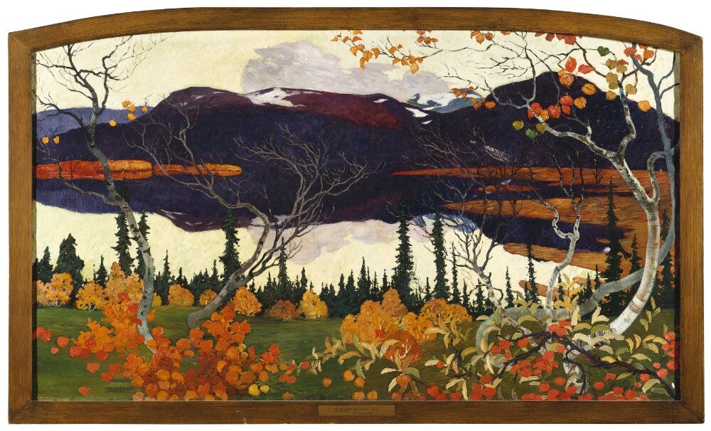
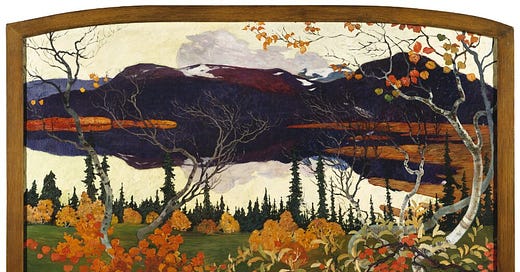
This summer while I was at Nationalmuseum in Stockholm, I bought a postcard of Helmer Osslund’s “Autumn.” From 1907, the painting was a part of a series of paintings devoted to the four seasons. The vertical postcard is only a portion of the original framing (a good reminder of the power of cropping and framing), but what I really love about it besides the subject matter is the colors. Dark indigo, golden yellow, a few pops of orange and red and several shades of green? It’s essentially my favorite color palette.
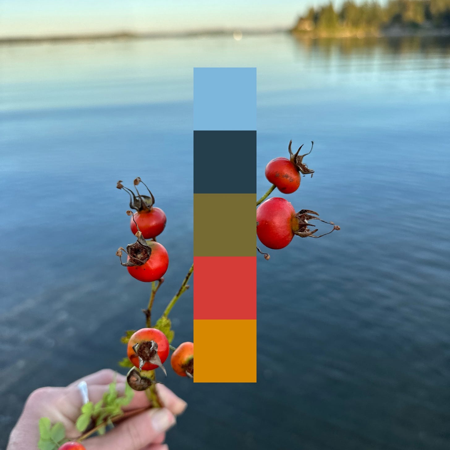
I like to find this pairing in the natural world. Aging leaves against a stormy sky is one place, red rosehips against a backdrop of saltwater is another. Of course, I’m prone to these colors and can easily find them at other times of the year. The yellow and red of nectarine slices next to a bowl of blueberries in the summer. The Scandinavian forest trifecta: chanterelles, blueberries, and lingonberries.
We’re surrounded by color, so overstimulated that we can forget to pay attention. Color, if we focus on it, is the perfect antidote for our overloaded and distracted brains, the starting point for a rich practice of attuning to what is around us.
This season calls for a color walk.
A color walk is largely what it sounds like: walking and paying attention to color. The idea is simple: choose a color and follow it around.
The concept is usually credited to William S. Burroughs, who developed the idea as a challenge for his students. Burroughs wrote:
Another exercise that is very effective is walking on colors. Pick out all the reds on a street, focusing only on red objects–brick, lights, sweaters, signs. Shift to green, blue, orange, yellow. Notice how the colors begin to stand out more sharply of their own accord.
A color in one object leads you to another. The golden yellow of a leaf, a stripe of paint on the road, a signpost, the shade of sunlight as it bounces off the trees at the end of the day. Colors end up linking to memory too, a catalyst for conjuring up moments of that precise color from the past. Sharpening a pencil, taking the school bus, cleaning chanterelles on a table covered in newspaper.
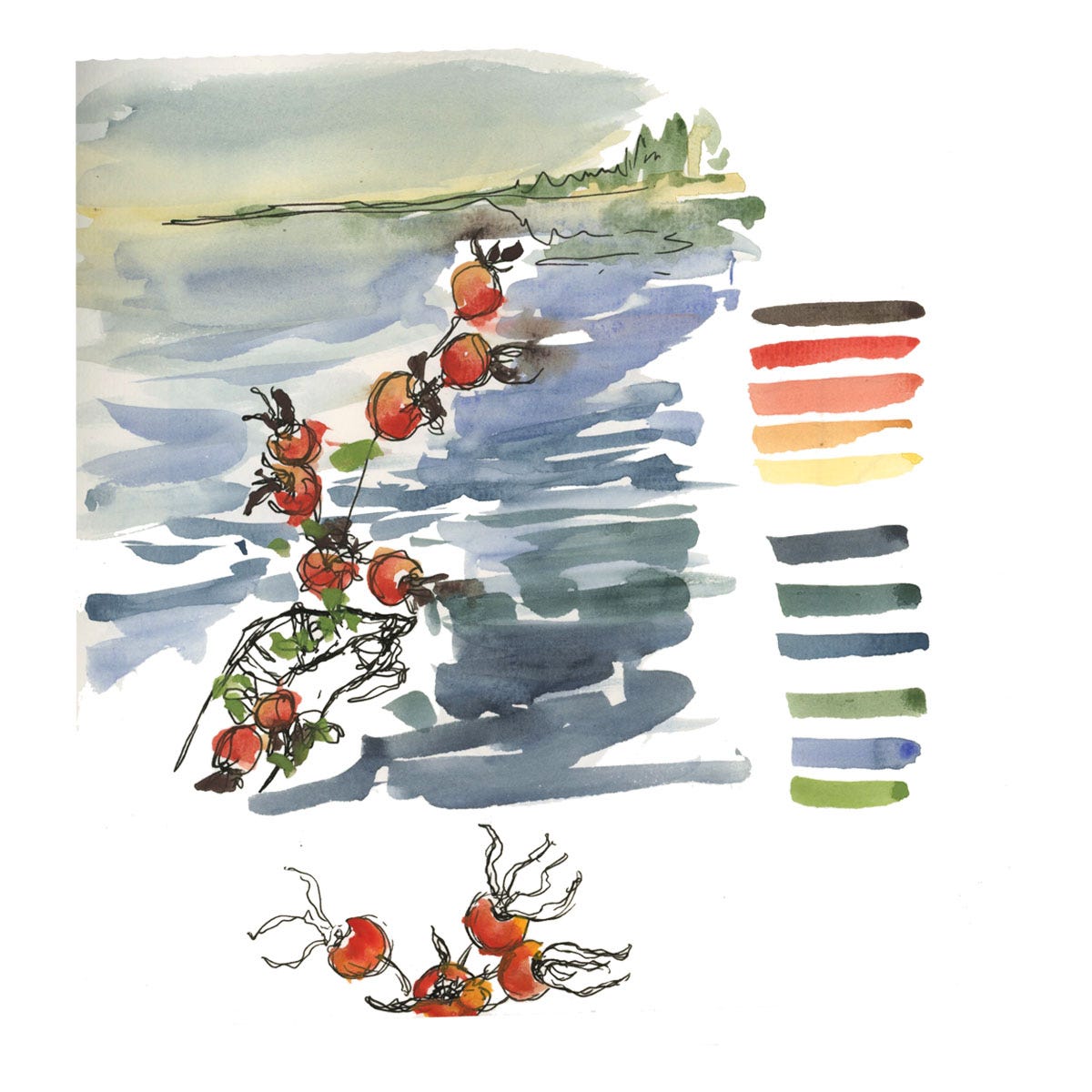
If you want a more tangible practice than just thinking about colors, make a few watercolor palettes of the colors that you see. Or use more digital methods. I always like using the Coolors app for generating digital color palettes (like the one above), and
has a recent piece on a practice of collecting digital color samples.
For this month’s edition of Nice Things, let’s take a little wander through autumn color palettes. In the hopes that it sparks a little desire to go on your own color walk.
-Anna
As always these monthly installments of Nice Things are for paid subscribers. They’re a little thank you for being here. The majority of Creative Fuel is free for everyone, and I’m grateful to paid subscribers for making the production of this newsletter sustainable. If you like getting Creative Fuel, maybe today is the day you become a paid subscriber!
The Colors of Autumn
If we’re going to talk about seasons and color palettes, changing leaves or art isn’t even the first thing that might come to mind. Lets go back to the 1980s, a time which popularized thinking about season and color in the wardrobe, leading people to ask questions like, “are you a Summer or an Autumn?”
Honestly this question just makes me roll my eyes (“I’m a whatever I want to be thank you very much!”), but it has been a guiding light for many. If you’ve ever thought about how you relate to color in the clothes you wear, then you probably have Color Me Beautiful to thank. Published in 1980, it was wildly popular thank to its “perfect balance between esoteric and logical,” writes Angelica Frey in a great Jezebel article on the history of color palettes in our wardrobes.


