An Investigation into Color
A creative prompt (and inspiration from Mary Gartside, Emily Noyes Vanderpoel, Hilma af Klint and Alma Woodsey Thomas) to explore the color that's found all around us
Creative Fuel is a newsletter about the intersection of creativity and everyday life. Prompts are focused on helping us tap into our creative process, no matter our medium, and I send at least one per month to all subscribers. Paid subscribers have full access to the archive of prompts.
In honor of Women’s History Month, all of the weekly creative prompts during this month are going to be inspired by women artists.
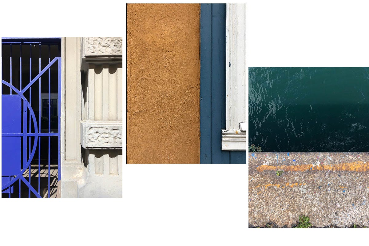
I want to start this month with color. Why? First because we’re in a time of year when the color is starting to return. And even if we’re still in the damp gray of winter, there’s color somewhere. As
wrote yesterday, “If there is colour to be found, it’s in a shrivelled wild rosehip or the orangey stain of an old brown leaf on grainy white snow, or a lacy green-grey pancake of lichen on a fallen branch, but that’s about it.”Secondly: I love color. I love looking at it, I love experimenting with it, and I love the joy that comes with simply putting color on a page.
Let’s start with this question: color or colour? We are all on various sides of the pond, so I am just going to go ahead and interchangeably use these spellings, thereby adding more colo(ur) to this prompt. See what I did there?
Most of my professional work is actually in black and white, and I love the starkness and the graphic nature of working in positive and negative space. In all honesty, I also love its simplicity. It feels less complicated merely because there’s less choice. And perhaps this is why I love color so much, because in my personal creative practice I feel like I get to play and experiment and do something different than I would for work, so using color feels radical and indulgent.
I also love that color can be intuitive, fluid and soft, and it can also be analytical and rules-based, graphic and uniform. Here’s an excellent example from the work of Emily Noyes Vanderpoel’s book Color problems: A practical manual for the lay student of color, published in 1902.
If you’re thinking to yourself, “my, that work looks very modern but she published that in 1902??” welcome to the world of women artists who were very ahead of their time and are only now getting their notoriety. Here’s another one:
It took the art world decades to showcase Swedish artist Hilma af Klint, but today, her work is shown all around the world, with colours that feel like they could have been painted today.
When it comes to thinking about color, most of us may recognize the name Johann Wolfgang von Goethe, but several years before he published his Theory of Colours, a woman named Mary Gartside did her own color investigation, revealing “evidence of extraordinary creative genius.” Her work, An Essay on a New Theory of Colors, published in 1808, is a full century before Noyes Vanderpoel, and is also incredibly modern in nature.
How do you even choose colors in the first place? And why do certain colors feel “right” to you when paired together?
Yes, you can learn the ins and outs of color theory, but color is incredibly personal. Colors, “should be understood as subjective cultural creations: you could no more meaningfully secure a precise universal definition for all the known shades than you could plot the coordinates of a dream,” writes Kassia St. Clair in The Secret Lives of Colour.
There’s even the concept of chromophobia, the idea that there is “a fear of corruption or contamination through color” that’s tied up in the history of colonialism and results in things like Western neutral aesthetics. As Carolyn Purnell writes, “some of our cultural preferences have deep-seated histories, associations, and legacies. The very idea of ‘good taste,’ as opposed to the ‘garishness’ and ‘tackiness’ of colors that we say hurt our eyes or that we find offensive, draws on a deep well of cultural assumptions of what is ‘normal’ or ‘refined.’”
If color is so personal and so cultural, then it’s worth investigating it in a deeper way. It’s worth paying attention to.
In 2018, my good friend and artist Paula Flach started The Colour Archive, setting out to map experiences and emotions through color. She comes up with four colours a week, which is 208 a year. She mixes and blends, and gives the color a name, like “outbound green” or “yeah no decision lilac.”
At first it might not make sense to everyone to interpret emotions in this way, but the reality is that color exists because we are interacting with the world around us. As Victoria Finlay points out in Color: A Natural History of the Palette: “…Color—like sound and scent—is just an invention of the human mind responding to waves and particles that are moving in particular patterns through the universe—and poets should not thank nature but themselves for the beauty and the rainbows they see around them.”
The world around us offers up an array of light and waves, but we decide what to name it, how to interpret it, and what to do with it.

Color asks us to see and interpret, it calls on us to interact with the world around us.
That’s what we’re going to do today. There are so many ways to explore color, but let’s start with a question (and as always, you can take these as literally or as figuratively as you would like… in any kind of medium):
What is your color palette?
You can take that to mean whatever you want it to. It can be a physical or emotional palette. What colours stand out to you? What do they represent?
What colors do you see?
Take an opportunity for observation. What colors do you physically see around you? What’s in your house? What’s in your coffee cup? What’s in the sky? What’s in the trees? What’s on the ground? What colors do you pick up on everyday? What’s a color you don’t normally think about and can you focus on seeing all the places you can find it today?
What colors do you want to bring in?
The beauty of art is that we get to create and shape the worlds that we want. What colors do you want to welcome in? What brings you joy on the page? This is also where it can be fun to go back through old photos, and see what colors you have been drawn to in the past.
When have you lacked color or struggled to find it?
What are the times when you’ve felt devoid of color, or when the usual color palette of your life has shifted?
What is the color of today?
If you only had to pick one, or you had to make one up, what would it be?
In our weekly Creative Fuel sessions, we often make color palettes, putting down a few blocks of color (or even just words) that represent that day physically or emotionally. It’s a great way to tap into how you feel and where you are.
That’s it! Go get after those colors.
“Through color,” Alma Woodsey Thomas said, “I have sought to concentrate on beauty and happiness, rather than on man’s inhumanity to man.”
MORE COLOR READING + INSPIRATION
Some contemporary visual artists who work with color in beautiful ways and I am always inspired by: Lisa Solomon, Courtney Cerruti, Leah Rosenberg, Anjelika Deogirikar Grossman, Heather Bird Harris, Karen Vaughan/Art of Soil, Anong Beam, Victoria Villasana. And of course there are SO many more. I would love to hear about more in the comments!
If you’re excited about color and looking to get into watercolor, Lisa Solomon’s A Field Guide to Color is an excellent place to start.
Can you invent your own color?
What happens when you discover a new blue.
What color is your name? If you don’t see words and colors, you can with this very neat synesthesia tool.
Like creative prompts and inspiration? Come join us for a free weekly Creative Fuel Wednesday session or one of the Creative Fuel Collective workshops.
Your article has inspired me am to find a wild area and see how the seasonal colors change. Does an oak tree have four seasons of green shades?...
Thank you for the shout out Anna! Yes, I do *love* color!! There are so many artists who inspire me with how they use color. I learned about Mary Gartside and Emily Noyes Vanderpoel from this post — now I have to learn more about these artists!